Picking a paint color, and the whole process of painting isn’t really that easy. For me, it’s probably the most stressful.
First of all, in the store it’s next to impossible to be able to know what those colors will look like in your house in non-flourescent lighting. So, I used to always end up taking 50 paint swatches home and then getting overwhelmed. It ends up being the process of elimination instead of falling in love with any one specific color.
The other thing is, it’s impossible to know how the color is going to make the room feel and how it’s going to look on all of the different angles and in different areas of light without actually painting the whole dang room. Which leads me to the point of this blog post. I believe I’ve found the shortest way to picking the perfect paint. It’s worked for me at least! Here are the five lessons, and how I came to learn them (the hard way).
Lesson 1: DO NOT Rely on the Name of the Paint Color.
When we moved in, we started the painting in our living room. It was the biggest room and we figured it’d be best to paint before the couches were delivered. I knew I wanted a soft, modern, light gray. Unfortunately, during a quick trip to Lowes, I rushed into purchasing two gallons of Contemporary Gray by Sherwin Williams….
I thought, great! Someone knew exactly what I wanted: a contemporary light gray (which is exactly what it looked like in the store). I purchased the two gallons in satin (another mistake which I’ll get to in a minute) and thought I was on a roll (no pun intended) leaving the store having made the first decision for the design of our house.
So, on that cold December night, Goodman and I painted the entire living room, we cut in without tape, applied two coats and at around 2am we retired to bed – which at the time was a mattress on the floor in the middle of our master bedroom.
We woke up in the morning and went downstairs and I about fell to my knees and cried (I’m exaggerating but you get the picture). It was not what we were going for, and we’d spent so much time on it the night before.
Lesson 2: Consider All Times of Day
Seriously, it was like light blue/periwinkle/gray. It was like a mood ring on all of the different walls. Because we had to keep rolling with renovations to get our house in living order, we had to keep it like that for almost 6 months! Some people said that they really liked it – but I really did not and that’s all that matters.
You can see the vast difference in this photo below. The cutting in that I did around the trim and window in this picture is the Mindful Gray that we ended up going with. The wall color is the Contemporary Gray freakin’ blue.

So, my second piece of advice is to paint a significant spot, or maybe even a couple of different spots in the room you will be painting with your paint sample to really see how it will look at the different angles. Then, wait an entire day so that you can see the color in the daylight and at night time to be sure you like the way that it looks in all lighting situations before committing to the paint purchase.
Lesson 3: Consider the Contrast
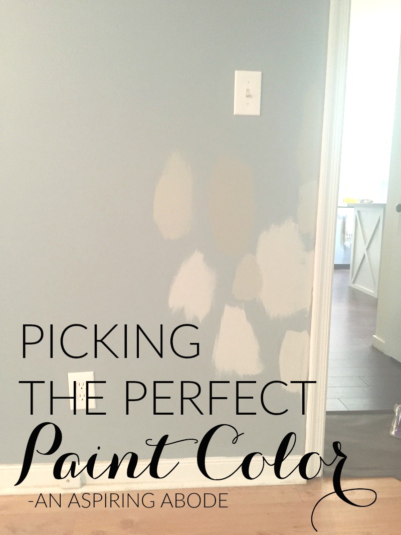
What color is your couch? What are the other colors that you plan on having in your living room, dining room, etc. It’s important to remember the context in which you are going to see the paint color. If you have dark/medium couches and accents of teal in your living room like we do, the gray needs to have brown or white undertones not to look blue like our first paint color turned out.What color is your trim? What about your floors? Consider all of these things.
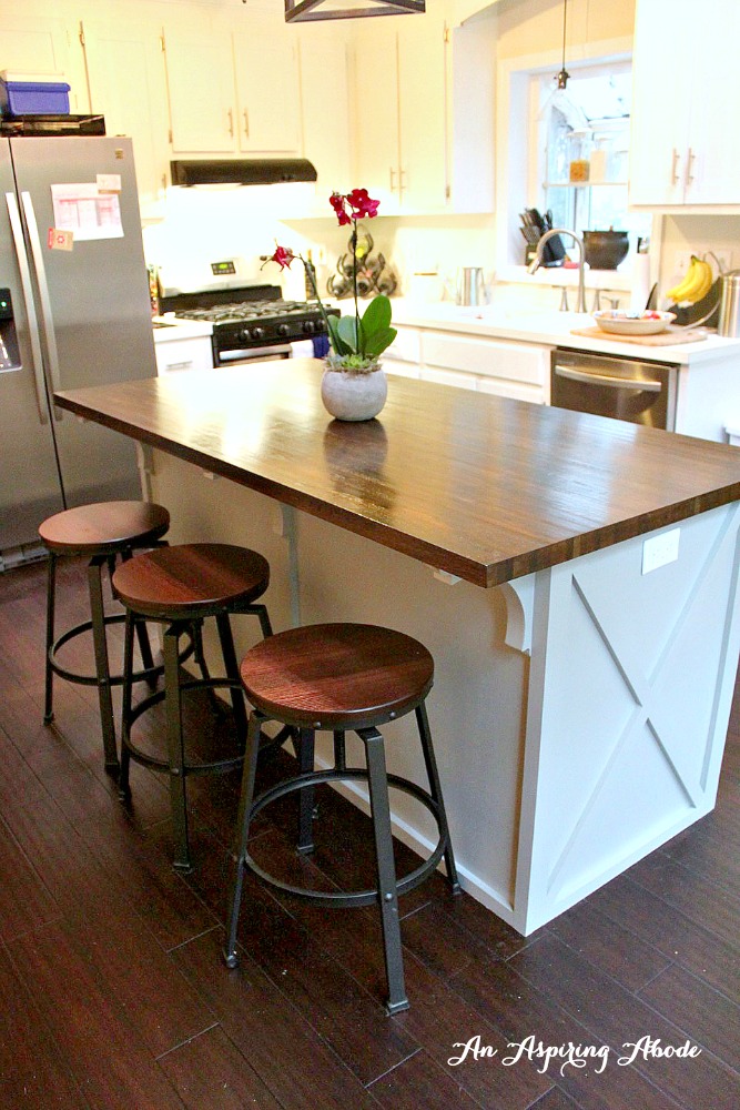
To be sure I was making the right choice this time, I got a bunch of samples and threw all of them up on the wall in several spots where the light was different. Including this spot where it was semi-dark and close to our trim, dark gray couches and where you could compare to the gray that was on our island in the kitchen. (This was also while we were doing the floors much darker)

Lesson 4: Consult Pinterest
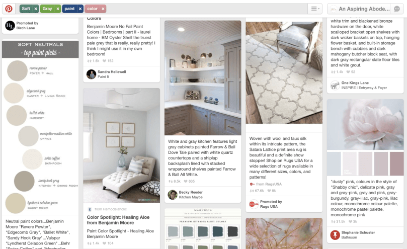
As a user experience architect, I should have known to do my research and find out which paint colors had become popular for their pretty color on Pinterest. Use the knowledge and experience of others! Chances are that people have probably wanted the same kind of look and feel that you have, and there are lots of professional interior designers on Pinterest giving out this FREE advice – take it! After the living room, I started to do this and I think it’s really paid off.
Because of Pinterest I found the perfect navy for our dining room, a great dark gray for our downstairs half bath, and a refreshing teal color for our guest bedroom and laundry/mudroom. I also found the solution to our living room – covering it up with Mindful Gray by Sherwin Williams. The full story and before and after of our living room colors is coming to the blog soon!
Lesson 5: Do Your Research on Appropriate Sheen
Cabinets do not look good in a flat white. You may not have ever noticed this but for your entire life most all of the cabinets you’ve ever encountered have probably been mostly shiny. Because of this, when you see cabinets that aren’t shiny it looks really weird.
The same goes for some rooms. Most rooms that contain some sort of water (i.e. kitchens, bathrooms, etc.) have a little bit of sheen to their finish. That’s because the more gloss you have, the easier they are to wipe clean. Stick with an satin sheen or higher for those rooms.
Bedrooms look much better in a flat or eggshell finish – it makes them feel very soft. and they will likely not get as much wear and tear as rooms like kitchen and bathrooms – making it okay that they aren’t as easy to clean.
If you have an old house that has a lot of imperfections in the walls you don’t want to go with something that has a high sheen – it will make all of those scratches and dents stick out like a little shiny sore thumb – Stick with flat. We made this mistake with our dining room! But, because the color is a dark navy it’s much harder to notice.
Lessons Learned
So, if you do all of those things, you are bound to make a great paint choice! It’s been working so far and I’ve taken my own advice in choosing the paint colors to fix some of the mistakes we made along the way to learning these lessons.
Here’s a sneak peak of the finished living room with the new Mindful Gray!

I hope these help you! Let me know what paint projects you have going on.
I’ll be doing another post soon on the things that you should and shouldn’t spend more mulah on when it comes to paint and some tips and tricks to finishing a paint job like a pro. Stay tuned!